Android开发者在编程过程中经常要涉及到美工方面的工作,而美工对开发者而言往往是不太擅长的。本文就从简洁易用的角度跟大家分享shape的使用方法。
Android中常常使用shape来定义控件的一些显示属性,在看了关于shape的一些用法技巧后,对shape有了大体的了解,下面进行大致的总结。
先看下面的代码:
- <shape>
- <!-- 实心 -->
- <solid android:color="#ff9d77"/>
- <!-- 渐变 -->
- <gradient
- android:startColor="#ff8c00"
- android:endColor="#FFFFFF"
- android:angle="270" />
- <!-- 描边 -->
- <stroke
- android:width="2dp"
- android:color="#dcdcdc" />
- <!-- 圆角 -->
- <corners
- android:radius="2dp" />
- <padding
- android:left="10dp"
- android:top="10dp"
- android:right="10dp"
- android:bottom="10dp" />
- </shape>
solid:实心,就是填充的意思
android:color指定填充的颜色。
gradient:渐变
android:startColor和android:endColor分别为起始和结束颜色,ndroid:angle是渐变角度,必须为45的整数倍。
另外渐变默认的模式为android:type="linear",即线性渐变,可以指定渐变为径向渐变,android:type="radial",径向渐变需要指定半径android:gradientRadius="50"。
stroke:描边
android:width="2dp" 描边的宽度,android:color 描边的颜色。
我们还可以把描边弄成虚线的形式,设置方式为:
android:dashWidth="5dp"
android:dashGap="3dp"
其中android:dashWidth表示'-'这样一个横线的宽度,android:dashGap表示之间隔开的距离。
corners:圆角
android:radius为角的弧度,值越大角越圆。
我们还可以把四个角设定成不同的角度,方法为:
- <corners
- android:topRightRadius="20dp" 右上角
- android:bottomLeftRadius="20dp" 右下角
- android:topLeftRadius="1dp" 左上角
- android:bottomRightRadius="0dp" 左下角
- />
这里有个地方需要注意,bottomLeftRadius是右下角,而不是左下角,这个有点郁闷,不过不影响使用,记得别搞错了就行。
还有网上看到有人说设置成0dp无效,不过我在测试中发现是可以的,我用的是2.2,可能修复了这个问题吧,如果无效的话那就只能设成1dp了。
padding:间隔
这个就不用多说了,XML布局文件中经常用到。
大体的就是这样,以下是一个使用的具体示例:用在Selector中作为Button的背景,分别定义了按钮的一般状态、获得焦点状态和按下时的状态,具体代码如下:
main.xml:
- <Button
- android:layout_width="wrap_content"
- android:layout_height="wrap_content"
- android:text="TestShapeButton"
- android:background="@drawable/button_selector"
- />
button_selector.xml:
- <?xml version="1.0" encoding="utf-8"?>
- <selector
- xmlns:android="http://schemas.android.com/apk/res/android">
- <item android:state_pressed="true" >
- <shape>
- <!-- 渐变 -->
- <gradient
- android:startColor="#ff8c00"
- android:endColor="#FFFFFF"
- android:type="radial"
- android:gradientRadius="50" />
- <!-- 描边 -->
- <stroke
- android:width="2dp"
- android:color="#dcdcdc"
- android:dashWidth="5dp"
- android:dashGap="3dp" />
- <!-- 圆角 -->
- <corners
- android:radius="2dp" />
- <padding
- android:left="10dp"
- android:top="10dp"
- android:right="10dp"
- android:bottom="10dp" />
- </shape>
- </item>
- <item android:state_focused="true" >
- <shape>
- <gradient
- android:startColor="#ffc2b7"
- android:endColor="#ffc2b7"
- android:angle="270" />
- <stroke
- android:width="2dp"
- android:color="#dcdcdc" />
- <corners
- android:radius="2dp" />
- <padding
- android:left="10dp"
- android:top="10dp"
- android:right="10dp"
- android:bottom="10dp" />
- </shape>
- </item>
- <item>
- <shape>
- <solid android:color="#ff9d77"/>
- <stroke
- android:width="2dp"
- android:color="#fad3cf" />
- <corners
- android:topRightRadius="5dp"
- android:bottomLeftRadius="5dp"
- android:topLeftRadius="0dp"
- android:bottomRightRadius="0dp"
- />
- <padding
- android:left="10dp"
- android:top="10dp"
- android:right="10dp"
- android:bottom="10dp" />
- </shape>
- </item>
- </selector>
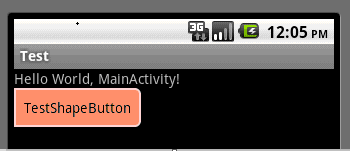
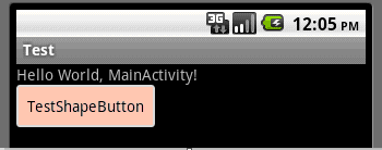
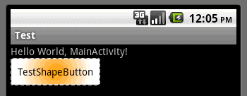
运行效果如下图:
一般状态:
获得焦点状态:
按下状态:

发表评论:
◎欢迎参与讨论,请在这里发表您的看法、交流您的观点。