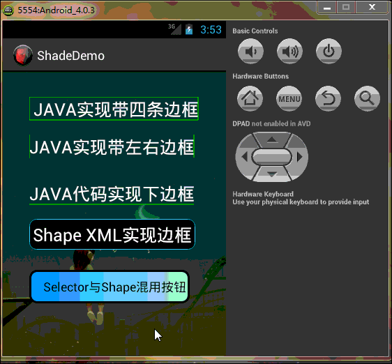
开始今天的主题,控件渲染Shade(也可以叫着色器)的使用,一直都有在关注这方面的东西,网上也有部分文章写得不错,但是还是觉得不过瘾,往往都是写一点点自己在工作中使用过的,有看到过很多人经典问这个边框那个边框的,呵呵,今天就总结下这方面的东西,希望对这块知识有兴趣的帅果、美驴们有所帮助或提高,也备自己不时之用,果断先看效果再一步步看代码!希望大家仔细看看我在XML及.java中添加的注释,相信你不会后悔花时间在这文章上的,今天的DEMO效果图如下:
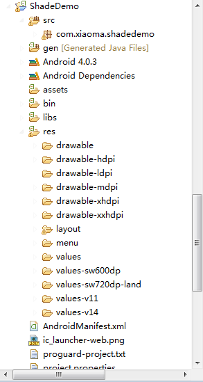
工程目录结构如下,由于太长的原因,部分已缩进:
好了,效果看完了,下一步开始看代码吧,亲…….静下心….一步步来!!! PS:模拟器与eclipse效果中
预览的以下部分有点不一样,可能是eclipse与模拟器二者之前存在Bug吧…吼吼….
首先,先做个小小的铺垫:
Android提供的Shader类主要是渲染图像以及一些几何图形。
Shader有几个直接子类:
BitmapShader : 主要用来渲染图像
LinearGradient :用来进行线性渲染
RadialGradient : 用来进行环形渲染
SweepGradient : 扫描渐变—围绕一个中心点扫描渐变就像电影里那种雷达扫描,用来梯度渲染。
ComposeShader : 组合渲染,可以和其他几个子类组合起来使用。
小记:Android控件渲染Shade的实现方式有两种,(一、JAVA代码实现;二、XML配置来实现),
自己比较偏向XML实现,原因很简单:
1.你代码实现写得再经典,不跑起来效果看不到!
2.跑一遍Android模拟器,思路可以断一大节!(我很笨,经常这样 T_T)!
3.JAVA代码的每个函数参数你也得一个个去啃(老板管效率,不管怎么实现,等你啃完参数时,XML已经看到效果了 O_o ……走起…..)!
4.这是最主要的一点,Eclipse或者I/O大会刚推出的Android Studio,实时显示,我就特别喜欢 立竿见影 ^_^ !
5.二者各有利弊,JAVA代码实现可以动态且灵活滴,XML配置的统一但不杂乱 @_@!!
Now…….. Ladies and 乡亲们,看举一种JAVA代码excmple,其余类型的与之类似,亲们自己“度娘 、谷哥 ”:
LinearGradient是线性渐变,用法如下:
Gradient是基于Shader类,所以我们通过Paint的setShader方法来设置这个渐变,代码如下:
Paint p=new Paint();
LinearGradient lg=newLinearGradien(0,0,100,100,Color.RED,Color.BLUE,Shader.TileMode.MIRROR);
Gradient是基于Shader类,所以我们通过Paint的setShader方法来设置这个渐变,代码如下:
p.setShader(lg);
canvas.drawCicle(0,0,200,p); //参数3为画圆的半径,类型为float型。
先不说效果了,PS:看着上面的代码,有没有想哭的冲动啊 ? ? ?感觉乱乱的,不知道是什么,然后单词gradient不懂,一查如下(晕),看着挺牛,还是只是个渲染!不管了,继续往下看…
再看XML布局文件代码:
一:主布局文件代码如下(为了方便,布局是直接拖的,大家不用太关注):
- <RelativeLayout xmlns:android="http://schemas.android.com/apk/res/android"
- xmlns:tools="http://schemas.android.com/tools"
- android:layout_width="match_parent"
- android:layout_height="match_parent"
- android:background="@drawable/background"
- android:paddingBottom="@dimen/activity_vertical_margin"
- android:paddingLeft="@dimen/activity_horizontal_margin"
- android:paddingRight="@dimen/activity_horizontal_margin"
- android:paddingTop="@dimen/activity_vertical_margin"
- tools:context=".MainActivity" >
- <com.xiaoma.shadedemo.TextViewBorder
- android:id="@+id/textView1"
- android:layout_width="wrap_content"
- android:layout_height="wrap_content"
- android:layout_alignParentLeft="true"
- android:layout_alignParentTop="true"
- android:layout_marginLeft="22dp"
- android:layout_marginTop="20dp"
- android:text=" JAVA实现带四条边框"
- android:textColor="@android:color/white"
- android:textSize="25sp" />
- <com.xiaoma.shadedemo.TextViewBorderLeftRight
- android:id="@+id/TextViewBorder01"
- android:layout_width="wrap_content"
- android:layout_height="wrap_content"
- android:textColor="@android:color/white"
- android:layout_alignLeft="@+id/textView1"
- android:layout_below="@+id/textView1"
- android:layout_marginTop="20dp"
- android:text="JAVA实现带左右边框"
- android:textSize="25sp" />
- <com.xiaoma.shadedemo.TextViewBorderUnder
- android:id="@+id/TextViewBorder02"
- android:layout_width="wrap_content"
- android:layout_height="wrap_content"
- android:layout_alignLeft="@+id/TextViewBorder01"
- android:textColor="@android:color/white"
- android:layout_below="@+id/TextViewBorder01"
- android:layout_marginTop="33dp"
- android:text="JAVA代码实现下边框"
- android:textSize="25sp" />
- <TextView
- android:id="@+id/TextViewBorderUnder01"
- android:layout_width="wrap_content"
- android:layout_height="wrap_content"
- android:layout_alignLeft="@+id/button1"
- android:layout_below="@+id/TextViewBorder02"
- android:layout_marginTop="20dp"
- android:text="Shape XML实现边框"
- android:background="@drawable/shape_test"
- android:textColor="@android:color/white"
- android:textSize="25sp" />
- <Button
- android:id="@+id/button1"
- android:layout_width="wrap_content"
- android:layout_height="wrap_content"
- android:layout_alignLeft="@+id/TextViewBorder02"
- android:layout_below="@+id/TextViewBorderUnder01"
- android:layout_marginTop="29dp"
- android:background="@drawable/shape_selector"
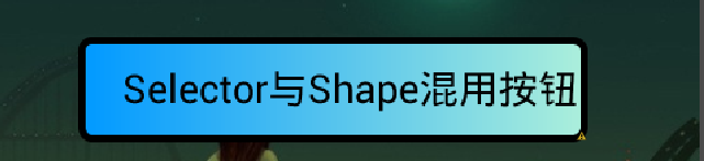
- android:text="Selector与Shape混用按钮"
- android:textColor="@android:color/black" />
- </RelativeLayout>
二:上面布局中使用的自定义控件代码及Shape渲染代码分别如下:
2.1:JAVA实现带四条边框(自定义TextView JAVA代码一)
- package com.xiaoma.shadedemo;
- import android.content.Context;
- import android.graphics.Canvas;
- import android.graphics.Color;
- import android.graphics.Paint;
- import android.util.AttributeSet;
- import android.widget.TextView;
- public class TextViewBorder extends TextView
- {
- /**
- * 下面两个方法在构造时需注意: 一:如果是XML文件加载的方式使用自定义控件到布局中是用以下方式, 二:如果是用纯代码的方式加载自定义的控制到而已中时用第二种方式
- */
- // 方式一:
- public TextViewBorder(Context context, AttributeSet attrs)
- {
- super(context, attrs);
- }
- // 方式二:
- /*
- * public TextViewBorder(Context context) { // TODO Auto-generated constructor stub super(context); }
- */
- /**
- * 1. Rect对象 一个区域对象Rect(left, top, right, bottom) , 是一个左闭右开的区域, 即是说使用 Rect.contains(left, top)为true,
- * Rect.contains(right, bottom)为false 2. drawLine方法 drawLine(float startX, float startY, float stopX, float stopY,
- * Paint paint) 也是一个左闭右开的区间,只会绘制到stopX-1,stopY-1 3. drawRect(Rect r, Paint paint) 当绘制空心矩形时,绘制的是一个左闭右闭的区域
- * 验证方法:下面就是可以验证左闭右开的区间方法,现在知道为什么要-1 了
- */
- @Override
- protected void onDraw(Canvas canvas)
- {
- super.onDraw(canvas);
- Paint paint = new Paint();
- paint.setAntiAlias(true);
- paint.setColor(Color.GREEN);
- canvas.drawLine(0, 0, this.getWidth() - 1, 0, paint);// 绘制上边框
- canvas.drawLine(0, 0, 0, this.getHeight() - 1, paint); // 绘制左边框
- canvas.drawLine(this.getWidth() - 1, 0, this.getWidth() - 1, this.getHeight() - 1, paint); // 绘制右边框
- canvas.drawLine(0, this.getHeight() - 1, this.getWidth() - 1, this.getHeight() - 1, paint);// 绘制下边框
- }
- /*
- * 1. Rect对象
- *
- * 一个区域对象Rect(left, top, right, bottom) , 是一个左闭右开的区域,即是说使用 Rect.contains(left, top)为true, Rect.contains(right,
- * bottom)为false
- *
- * 2.drawLine方法
- *
- * drawLine(float startX, float startY, float stopX, float stopY, Paint paint) 也是一个左闭右开的区间,只会绘制到stopX-1,stopY-1
- *
- * 验证方法:
- *
- * Canvas c = canvas; paint.setColor(Color.RED); c.drawLine(x, y, x+c.getWidth()-1, y, paint); c.drawLine(x,
- * y+height-1, x+c.getWidth(), y+height-1, paint); paint.setColor(Color.BLUE); c.drawPoint(x+c.getWidth()-1, y,
- * paint); 说明drawLine是没有绘制到右边最后一个点的
- *
- * 3.drawRect(Rect r, Paint paint)
- *
- * 当绘制空心矩形时,绘制的是一个左闭右闭的区域
- *
- * 验证方法:
- *
- * rect.set(x, y, x+width, y+height); paint.setStyle(Style.STROKE); paint.setColor(Color.BLUE); c.drawRect(rect,
- * paint); paint.setColor(Color.RED); c.drawLine(x, y, x+width, y, paint); c.drawLine(x, y+height, x+width,
- * y+height, paint); c.drawLine(x, y, x, y+height, paint); c.drawLine(x+width, y, x+width, y+height, paint);
- * 当绘制实心矩形时,绘制的是一个左闭右开的区域
- *
- * 验证方法:
- *
- * rect.set(x, y, x+width, y+height); paint.setColor(Color.RED); c.drawLine(x, y, x+width, y, paint); c.drawLine(x,
- * y+height, x+width, y+height, paint); c.drawLine(x, y, x, y+height, paint); c.drawLine(x+width, y, x+width,
- * y+height, paint); paint.setStyle(Style.FILL); paint.setColor(Color.BLUE); c.drawRect(rect, paint);
- * 这个规则跟j2me也是一样的,在j2me里,drawRect长宽会多画出1px。SDK的说明是:
- *
- * The resulting rectangle will cover an area (width + 1) pixels wide by (height + 1) pixels tall. If either width
- * or height is less than zero, nothing is drawn.
- *
- * 例如drawRect(10,10,100,1)绘制,结果是一个2px高的矩形,用fillRect(10,10,100,1),结果是一个1px高的矩形
- *
- * 以上就是对Android绘图的具体介绍。
- */
- }
- /**
- * 在布局文件中引用 这样引用就行了..吼吼 <com.xiaoma.shadedemo.TextViewBorder android:id="@+id/a02_txtKSSJ" android:textColor="#000000"
- * android:layout_marginLeft="10dip" android:layout_width="100dip" android:layout_height="wrap_content" />
- */
2.2:JAVA实现带左右边框(自定义TextView JAVA代码二)
- package com.xiaoma.shadedemo;
- import android.content.Context;
- import android.graphics.Canvas;
- import android.graphics.Color;
- import android.graphics.Paint;
- import android.util.AttributeSet;
- import android.widget.TextView;
- public class TextViewBorderLeftRight extends TextView
- {
- /**
- * 下面两个方法在构造时需注意: 一:如果是XML文件加载的方式使用自定义控件到布局中是用以下方式, 二:如果是用纯代码的方式加载自定义的控制到而已中时用第二种方式
- */
- // 方式一:
- public TextViewBorderLeftRight(Context context, AttributeSet attrs)
- {
- super(context, attrs);
- }
- // 方式二:
- /*
- * public TextViewBorder(Context context) { // TODO Auto-generated constructor stub super(context); }
- */
- /**
- * 1. Rect对象 一个区域对象Rect(left, top, right, bottom) , 是一个左闭右开的区域, 即是说使用 Rect.contains(left, top)为true,
- * Rect.contains(right, bottom)为false 2. drawLine方法 drawLine(float startX, float startY, float stopX, float stopY,
- * Paint paint) 也是一个左闭右开的区间,只会绘制到stopX-1,stopY-1 3. drawRect(Rect r, Paint paint) 当绘制空心矩形时,绘制的是一个左闭右闭的区域
- * 验证方法:下面就是可以验证左闭右开的区间方法,现在知道为什么要-1 了
- */
- @Override
- protected void onDraw(Canvas canvas)
- {
- super.onDraw(canvas);
- Paint paint = new Paint();
- paint.setAntiAlias(true);
- paint.setColor(Color.GREEN);
- canvas.drawLine(0, 0, 0, getHeight(), paint);
- // canvas.drawLine(getWidth(), 0, getWidth() - 1, getHeight() - 1, paint);
- canvas.drawLine(this.getWidth() - 1, 0, this.getWidth() - 1, this.getHeight() - 1, paint);
- // canvas.drawLine(0, 0, 0, this.getHeight() - 1, paint);
- // canvas.drawLine(this.getWidth() - 1, 0, this.getWidth() - 1, this.getHeight() - 1, paint);
- // canvas.drawLine(0, this.getHeight() - 1, this.getWidth() - 1, this.getHeight() - 1, paint);
- }
- /*
- * 1. Rect对象
- *
- * 一个区域对象Rect(left, top, right, bottom) , 是一个左闭右开的区域,即是说使用 Rect.contains(left, top)为true, Rect.contains(right,
- * bottom)为false
- *
- * 2.drawLine方法
- *
- * drawLine(float startX, float startY, float stopX, float stopY, Paint paint) 也是一个左闭右开的区间,只会绘制到stopX-1,stopY-1
- *
- * 验证方法:
- *
- * Canvas c = canvas; paint.setColor(Color.RED); c.drawLine(x, y, x+c.getWidth()-1, y, paint); c.drawLine(x,
- * y+height-1, x+c.getWidth(), y+height-1, paint); paint.setColor(Color.BLUE); c.drawPoint(x+c.getWidth()-1, y,
- * paint); 说明drawLine是没有绘制到右边最后一个点的
- *
- * 3.drawRect(Rect r, Paint paint)
- *
- * 当绘制空心矩形时,绘制的是一个左闭右闭的区域
- *
- * 验证方法:
- *
- * rect.set(x, y, x+width, y+height); paint.setStyle(Style.STROKE); paint.setColor(Color.BLUE); c.drawRect(rect,
- * paint); paint.setColor(Color.RED); c.drawLine(x, y, x+width, y, paint); c.drawLine(x, y+height, x+width,
- * y+height, paint); c.drawLine(x, y, x, y+height, paint); c.drawLine(x+width, y, x+width, y+height, paint);
- * 当绘制实心矩形时,绘制的是一个左闭右开的区域
- *
- * 验证方法:
- *
- * rect.set(x, y, x+width, y+height); paint.setColor(Color.RED); c.drawLine(x, y, x+width, y, paint); c.drawLine(x,
- * y+height, x+width, y+height, paint); c.drawLine(x, y, x, y+height, paint); c.drawLine(x+width, y, x+width,
- * y+height, paint); paint.setStyle(Style.FILL); paint.setColor(Color.BLUE); c.drawRect(rect, paint);
- * 这个规则跟j2me也是一样的,在j2me里,drawRect长宽会多画出1px。SDK的说明是:
- *
- * The resulting rectangle will cover an area (width + 1) pixels wide by (height + 1) pixels tall. If either width
- * or height is less than zero, nothing is drawn.
- *
- * 例如drawRect(10,10,100,1)绘制,结果是一个2px高的矩形,用fillRect(10,10,100,1),结果是一个1px高的矩形
- *
- * 以上就是对Android绘图的具体介绍。
- */
- }
- /**
- * 在布局文件中引用 这样引用就行了..吼吼 <com.xiaoma.shadedemo.TextViewBorder android:id="@+id/a02_txtKSSJ" android:textColor="#000000"
- * android:layout_marginLeft="10dip" android:layout_width="100dip" android:layout_height="wrap_content" />
- */
2.3:JAVA代码实现下边框(自定义TextView JAVA代码三)
- package com.xiaoma.shadedemo;
- import android.content.Context;
- import android.graphics.Canvas;
- import android.graphics.Color;
- import android.graphics.Paint;
- import android.util.AttributeSet;
- import android.widget.TextView;
- public class TextViewBorderUnder extends TextView
- {
- /**
- * 下面两个方法在构造时需注意: 一:如果是XML文件加载的方式使用自定义控件到布局中是用以下方式, 二:如果是用纯代码的方式加载自定义的控制到而已中时用第二种方式
- */
- // 方式一:
- public TextViewBorderUnder(Context context, AttributeSet attrs)
- {
- super(context, attrs);
- }
- // 方式二:
- /*
- * public TextViewBorder(Context context) { // TODO Auto-generated constructor stub super(context); }
- */
- /**
- * 1. Rect对象 一个区域对象Rect(left, top, right, bottom) , 是一个左闭右开的区域, 即是说使用 Rect.contains(left, top)为true,
- * Rect.contains(right, bottom)为false 2. drawLine方法 drawLine(float startX, float startY, float stopX, float stopY,
- * Paint paint) 也是一个左闭右开的区间,只会绘制到stopX-1,stopY-1 3. drawRect(Rect r, Paint paint) 当绘制空心矩形时,绘制的是一个左闭右闭的区域
- * 验证方法:下面就是可以验证左闭右开的区间方法,现在知道为什么要-1 了
- */
- @Override
- protected void onDraw(Canvas canvas)
- {
- super.onDraw(canvas);
- Paint paint = new Paint();
- paint.setAntiAlias(true);
- paint.setColor(Color.GREEN);
- // canvas.drawLine(0, 0, this.getWidth() - 1, 0, paint);
- // canvas.drawLine(0, getHeight(), getWidth() - 1, getHeight(), paint);
- // canvas.drawLine(this.getWidth() - 1, 0, this.getWidth() - 1, this.getHeight() - 1, paint);
- canvas.drawLine(0, getHeight() - 1, getWidth() - 1, getHeight() - 1, paint);
- }
- /*
- * 1. Rect对象
- *
- * 一个区域对象Rect(left, top, right, bottom) , 是一个左闭右开的区域,即是说使用 Rect.contains(left, top)为true, Rect.contains(right,
- * bottom)为false
- *
- * 2.drawLine方法
- *
- * drawLine(float startX, float startY, float stopX, float stopY, Paint paint) 也是一个左闭右开的区间,只会绘制到stopX-1,stopY-1
- *
- * 验证方法:
- *
- * Canvas c = canvas; paint.setColor(Color.RED); c.drawLine(x, y, x+c.getWidth()-1, y, paint); c.drawLine(x,
- * y+height-1, x+c.getWidth(), y+height-1, paint); paint.setColor(Color.BLUE); c.drawPoint(x+c.getWidth()-1, y,
- * paint); 说明drawLine是没有绘制到右边最后一个点的
- *
- * 3.drawRect(Rect r, Paint paint)
- *
- * 当绘制空心矩形时,绘制的是一个左闭右闭的区域
- *
- * 验证方法:
- *
- * rect.set(x, y, x+width, y+height); paint.setStyle(Style.STROKE); paint.setColor(Color.BLUE); c.drawRect(rect,
- * paint); paint.setColor(Color.RED); c.drawLine(x, y, x+width, y, paint); c.drawLine(x, y+height, x+width,
- * y+height, paint); c.drawLine(x, y, x, y+height, paint); c.drawLine(x+width, y, x+width, y+height, paint);
- * 当绘制实心矩形时,绘制的是一个左闭右开的区域
- *
- * 验证方法:
- *
- * rect.set(x, y, x+width, y+height); paint.setColor(Color.RED); c.drawLine(x, y, x+width, y, paint); c.drawLine(x,
- * y+height, x+width, y+height, paint); c.drawLine(x, y, x, y+height, paint); c.drawLine(x+width, y, x+width,
- * y+height, paint); paint.setStyle(Style.FILL); paint.setColor(Color.BLUE); c.drawRect(rect, paint);
- * 这个规则跟j2me也是一样的,在j2me里,drawRect长宽会多画出1px。SDK的说明是:
- *
- * The resulting rectangle will cover an area (width + 1) pixels wide by (height + 1) pixels tall. If either width
- * or height is less than zero, nothing is drawn.
- *
- * 例如drawRect(10,10,100,1)绘制,结果是一个2px高的矩形,用fillRect(10,10,100,1),结果是一个1px高的矩形
- *
- * 以上就是对Android绘图的具体介绍。
- */
- }
- /**
- * 在布局文件中引用 这样引用就行了..吼吼 <com.xiaoma.shadedemo.TextViewBorder android:id="@+id/a02_txtKSSJ" android:textColor="#000000"
- * android:layout_marginLeft="10dip" android:layout_width="100dip" android:layout_height="wrap_content" />
- */
2.4:Shape XML实现边框(XML代码)
- <?xml version="1.0" encoding="utf-8"?>
- <shape xmlns:android="http://schemas.android.com/apk/res/android" >
- <!-- <solid android:color="#cceeff"/> 直接写这个的话,可以给控制添加一个整体的背景哦 -->
- <stroke
- android:width="0.5dp"
- android:color="#22ccff" />
- <padding android:left="5dp" android:top="5dp" android:right="5dp" android:bottom="5dp"/>
- <size
- android:height="0.5dp"
- android:width="5dp" />
- <!-- 目前没有什么用,可删除,留在这个地方防止乱猜 -->
- <corners android:radius="10dp" />
- <!-- 这个radius里面的值需要个整型,单位用dp,用其它单位亦无影响 -->
- </shape>
2.5:Selector与Shape混用控件效果实现
- <?xml version="1.0" encoding="utf-8"?>
- <selector xmlns:android="http://schemas.android.com/apk/res/android">
- <!-- 今天主要讲的是shape渲染,shape主要类型分四种,效果如下,我们常用rectangle,也就是矩形渲染,其它的都太丑了!! -->
- <item android:state_pressed="true"> <!--按钮按下时的渲染效果 -->
- <shape android:shape="oval">
- <corners android:radius="10dp" /> <!-- 四个角的角度 -->
- <!--gradient就是梯度渲染,简单说就是颜色渐变,type为渐变方式,总共三种 linear sweep ridial,常用linear-->
- <gradient android:endColor="#eebbbb" android:startColor="#9900ee" android:type="linear" />
- <!-- padding属性是指定内容与控件边距,这个地方小马专门将距左边距设置较大,方便观察 -->
- <padding android:bottom="5dp" android:left="20dp" android:right="5dp" android:top="5dp" />
- <!-- solid填充整个区域,颜色为FFDDFF,如果使用整个区域填充的话,上面的gradient梯度会失效,即:覆盖 -->
- <!-- <solid android:color="#FFDDFF"/> -->
- <!-- stroke为需要填充的边框,指定颜色及边框宽度 -->
- <stroke android:width="3dp" android:color="#000000" />
- </shape>
- <!-- <clip android:clipOrientation="vertical" android:gravity="right" android:drawable="@drawable/ic_launcher" /> --><!-- 试了下没用 -->
- <!-- <color android:color="#223344"/> -->
- <!-- <scale android:scaleWidth="15dp" android:scaleHeight=" 5dp" android:scaleGravity="center" /> -->
- </item>
- <item> <!-- 默认 -->
- <shape android:shape="rectangle">
- <corners android:radius="10dp" /> <!-- 四个角的角度 -->
- <!--gradient就是梯度渲染,简单说就是颜色渐变,type为渐变方式,总共三种 linear sweep ridial,常用linear-->
- <!-- 这个地方一定注意,在使用gradient标签中使用android:type的前提是必须android:gradientRadius="20dp"已经设置,否则会报错 -->
- <gradient android:endColor="#acefda" android:startColor="#0099ff" android:type="linear" />
- <!-- padding属性是指定内容与控件边距,这个地方小马专门将距左边距设置较大,方便观察 -->
- <padding android:bottom="5dp" android:left="20dp" android:right="5dp" android:top="5dp" />
- <!-- solid填充整个区域,颜色为FFDDFF,如果使用整个区域填充的话,上面的gradient梯度会失效,即:覆盖 -->
- <!-- <solid android:color="#FFDDFF"/> -->
- <!-- stroke为需要填充的边框,指定颜色及边框宽度 -->
- <stroke android:width="3dp" android:color="#000000" />
- </shape>
- </item>
- </selector>
怎么样?看着JAVA自定义TextView代码是不是觉得特别的繁琐?今天的主题就是来解决这个问题的….…^_^………下面着重来讲一下Selector与Shape混用控件效果Selector实现的细节,(请仔细看下XML里面的注释 O_O)
每个Item过是由Shape来进行渲染生成最终的效果,首先来看根Shape节点的常用属性<shape android:shape=”rectangle”>:
这个shape属性总共分三种 rectangle(矩形)、oval(椭圆) 、line(删除线)、ring(铃,这个存在不知道有什么意义),其效果分别如下:
1.rectangle
2.oval

3.line

4.ring

其中,gradient标签中的type为渐变方式,总共三种 linear sweep ridial,常用linear,其效果分别为(注意:ridial试了无任何效果 T_T)
1.linear效果

2.sweep效果

好了,代码及整体效果已经分解完毕了,如果认真从头到尾的看一边的话,肯定有所收获的,对了,以上的Shape渲染写好了,可以在任意控件上使用…不限于TextView,上面的例子只是拿TextView来开刀用的…大家别误会,呵呵….^_^…. ,最后,希望在文章中有什么不清楚或不明白或有错误的地方,请大家直接指出…有错必改的….这个源码已经上传到http://mzh3344258.blog.51cto.com/1823534/1215749最下面附件中,有兴趣或有用的朋友可以直接下载来跑跑改改看,有批评才有进步,希望有什么不好的,直接指出….在此先谢谢大家啦….
官网参考链接如下(只是没效果图,所以大家也懒得去看这个东西)
http://developer.android.com/guide/topics/resources/drawable-resource.html

发表评论:
◎欢迎参与讨论,请在这里发表您的看法、交流您的观点。